IKEA SUPPLY AREA NORHT AMERICA, KING OF PRUSSIA
concept development, INTERIOR & GRAPHIC DESIGN
Background
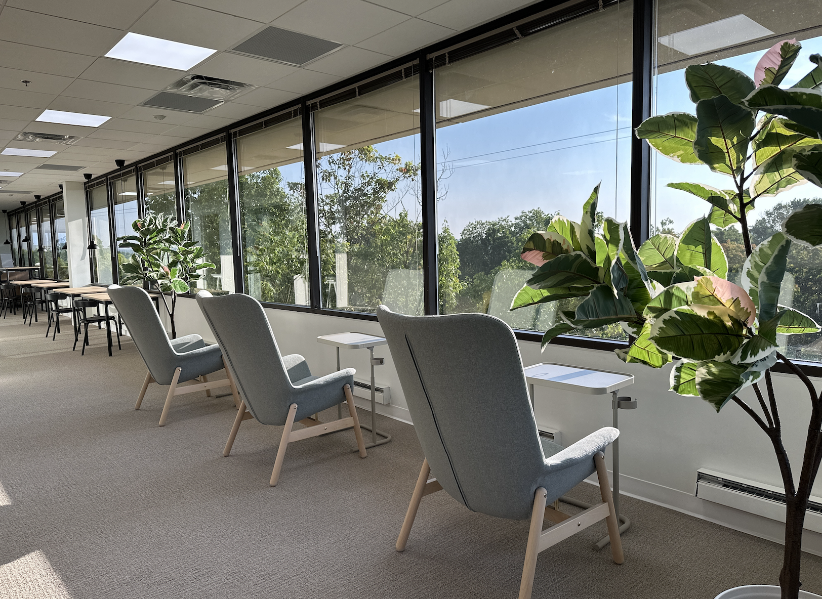
We started this project with great energy and passion by first evaluating the existing premises and concluded that the best option was to move to the neighboring building, to a larger floor at the top. Here, there is a fantastic view, and we did not need to reassess various aspects such as area safety, parking possibilities, distance to the city center, and employee commute times, saving both time and money, as the move was only 100 meters. Despite the short move, the new location offered significant opportunities.
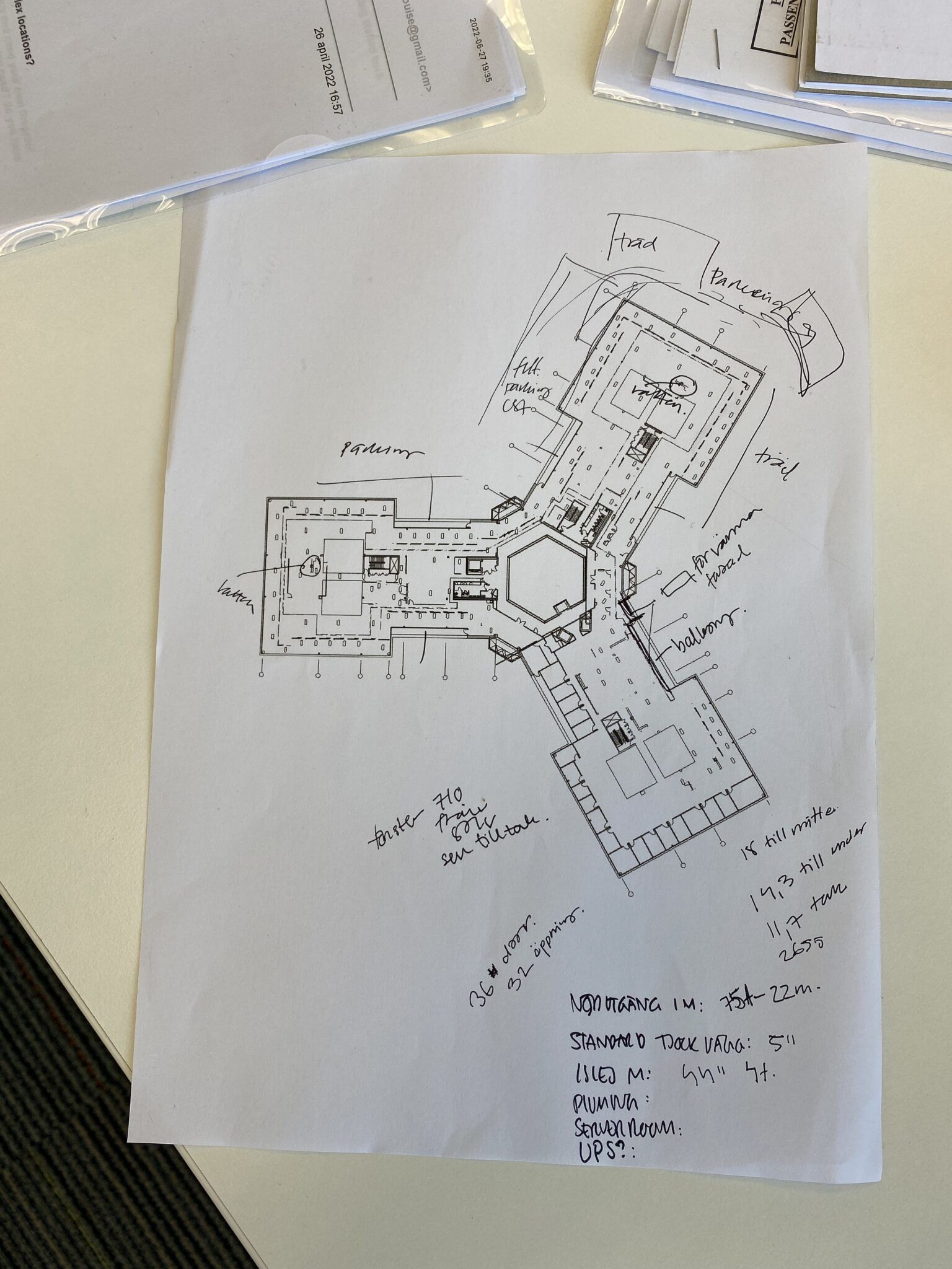
We decided to visit the site to experience the layout, ceiling height differences, and installations in person. Although floor plans and guided FaceTime tours were helpful and done several times, nothing could replace the physical meeting with everyone involved and experiencing the nearly 4000 square meter star-shaped layout, which is unique and special.
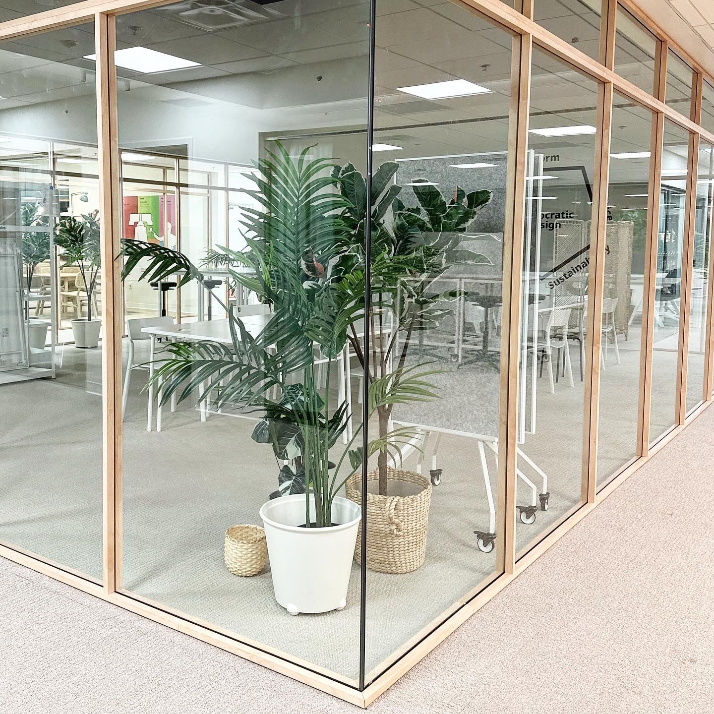
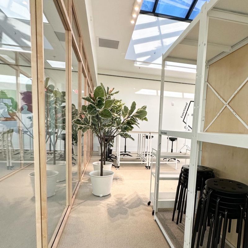
In July, we flew to New York and drove to Philadelphia for an intense week of visiting the layout, meetings with the landlord and project manager, and sketching the first drafts for floor plans, flow, and construction/demolition. There was a lot to demolish, primarily to free up the window areas and allow more light and views, which were currently blocked by small offices. Even in the center of the layout, this top level had a unique set of four large skylights that were currently blocked, but we wanted to create various rooms with special functions, both open and closed. We did not want to discard all the materials, as they were in good condition, and asked the builders to recycle the aluminum frames and re-cover them to resemble light wood, and reuse the large glass panels according to our new layout. Everyone was very solution-oriented and efficient in their work.
Result
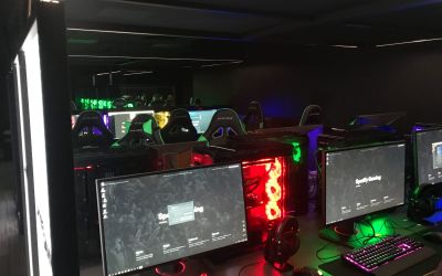
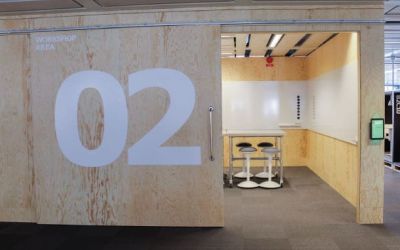
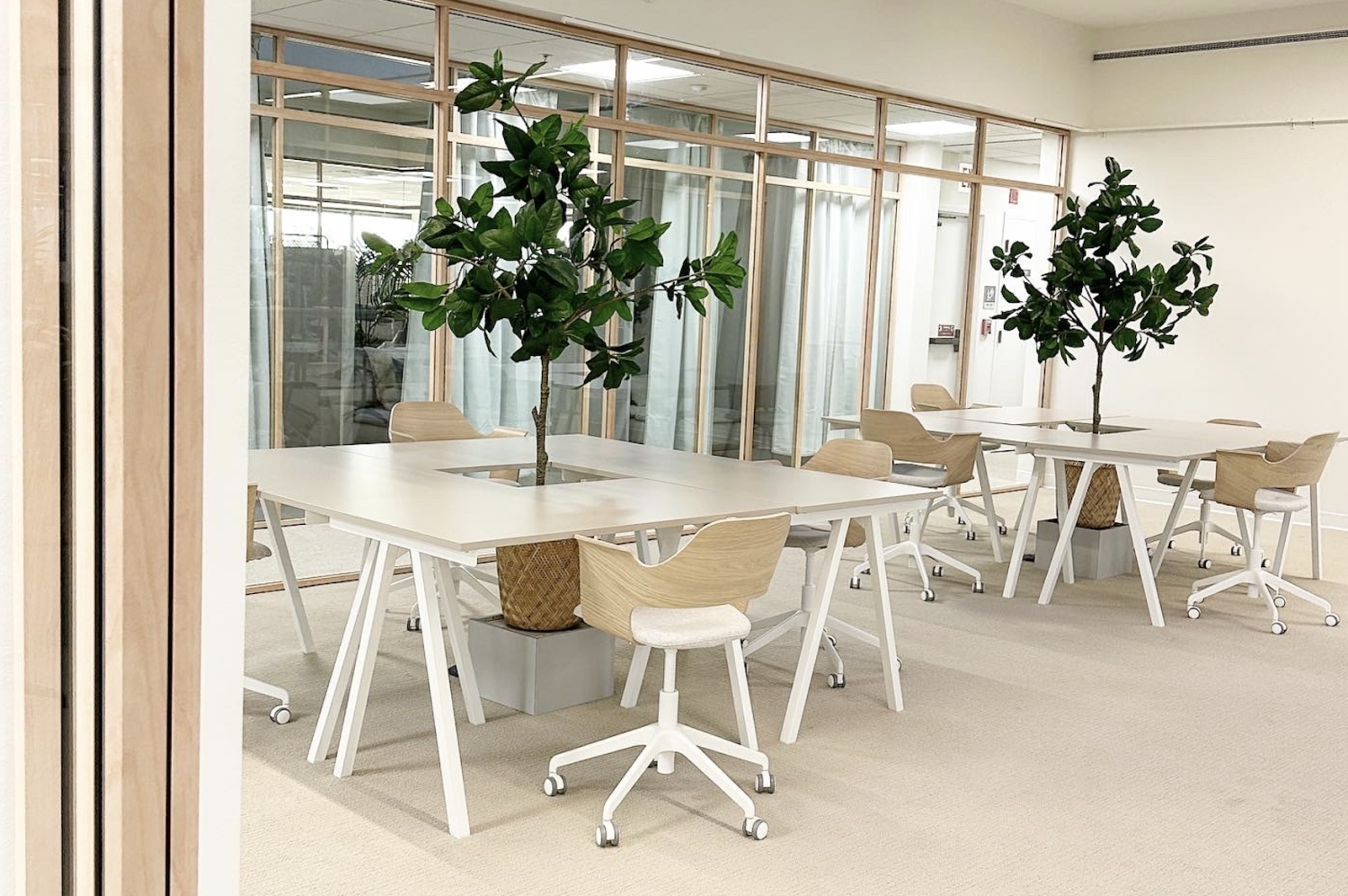
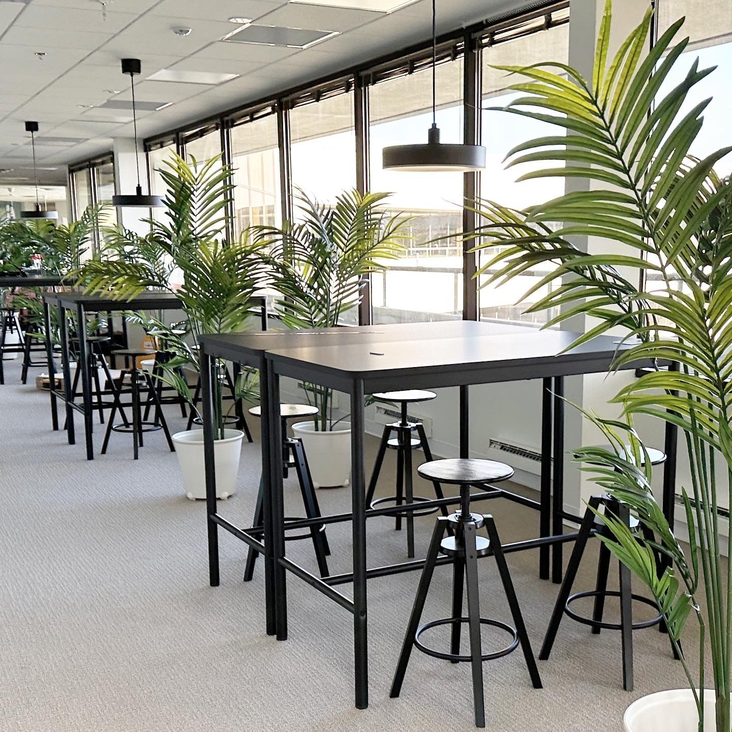
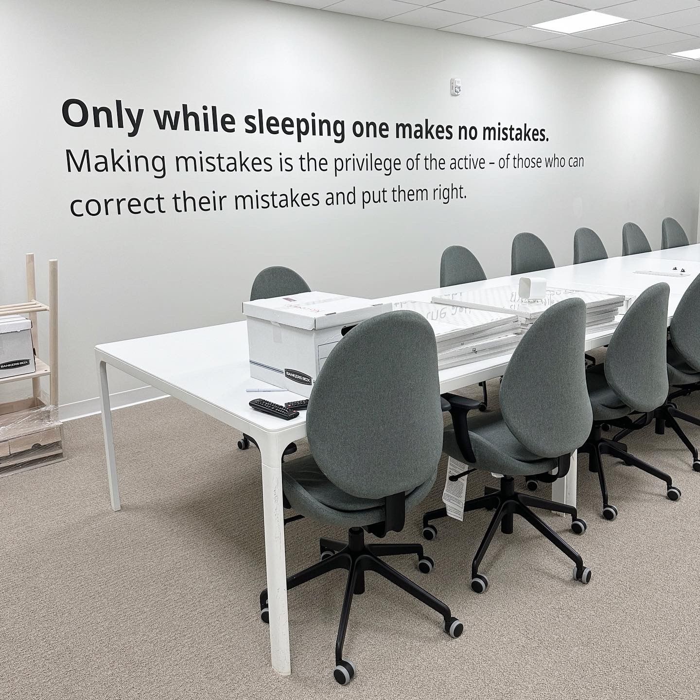
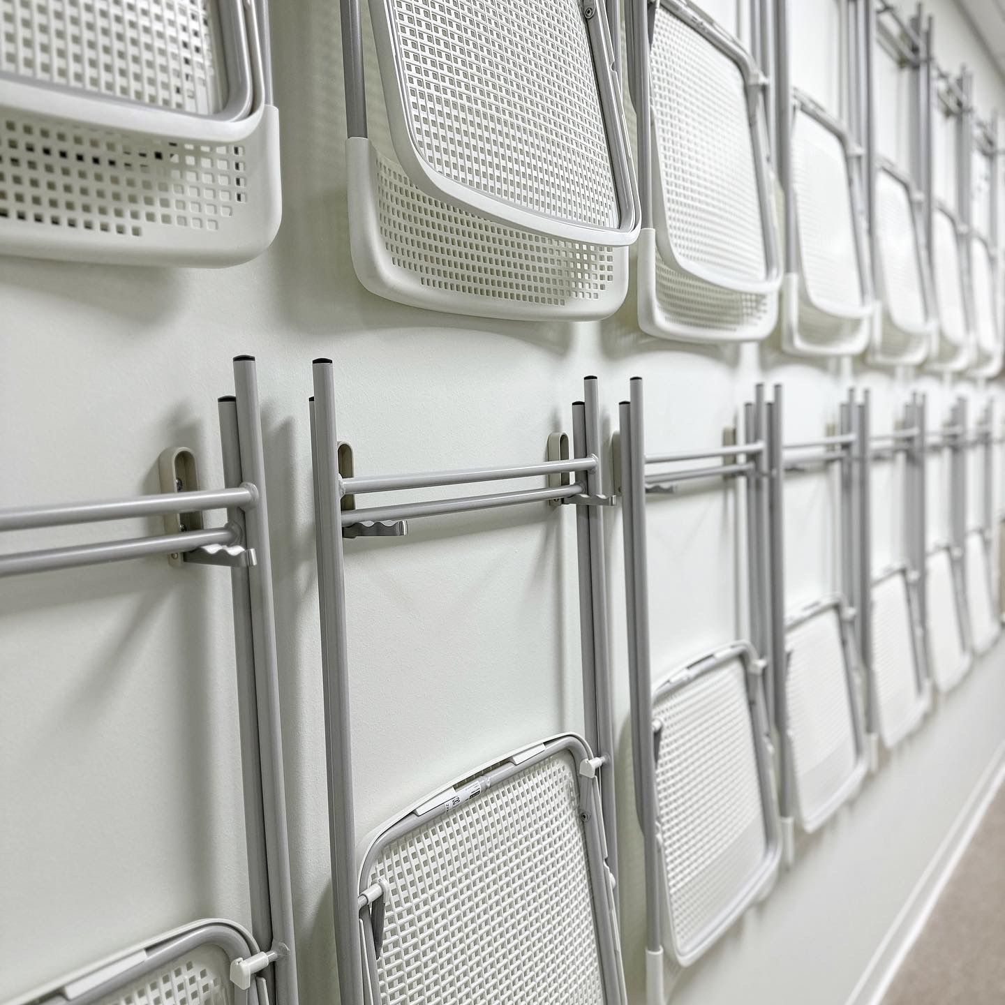
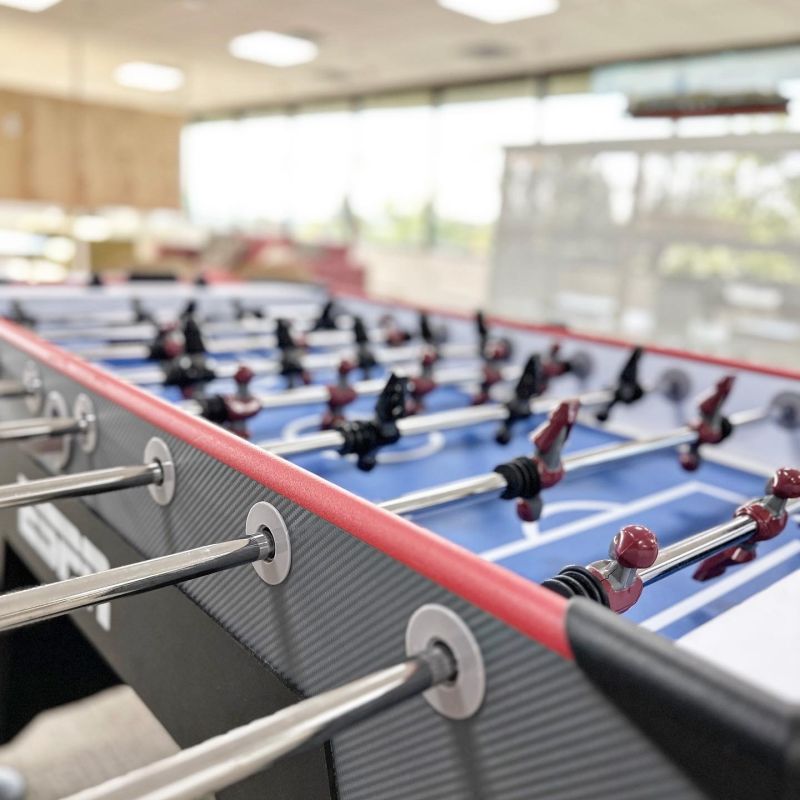
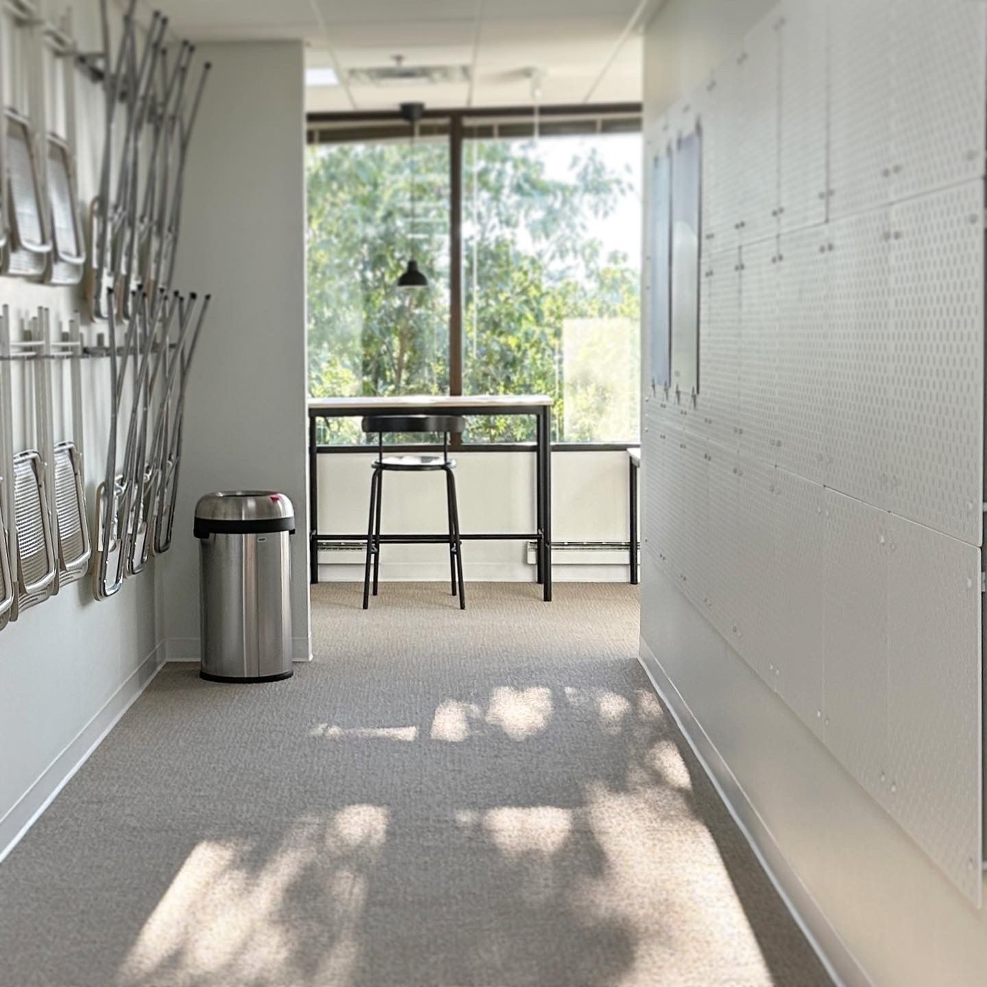
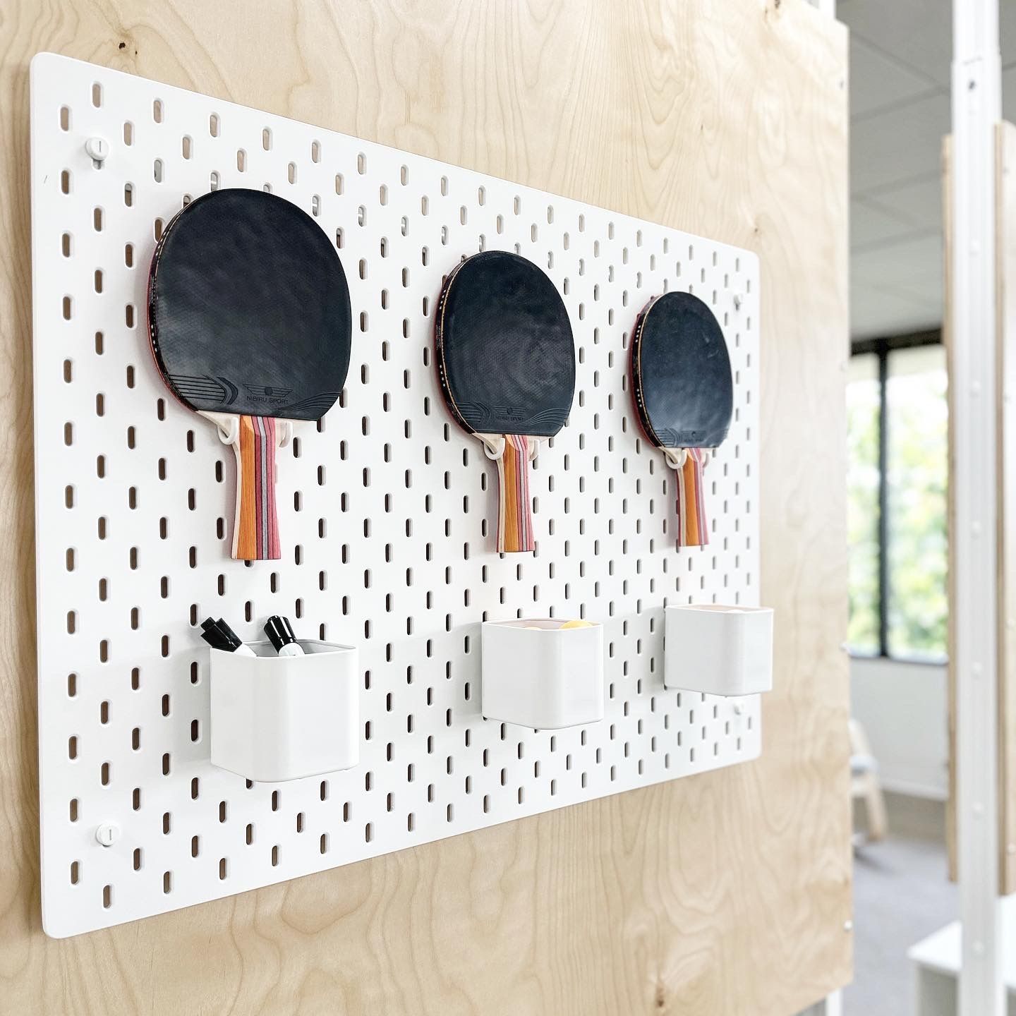
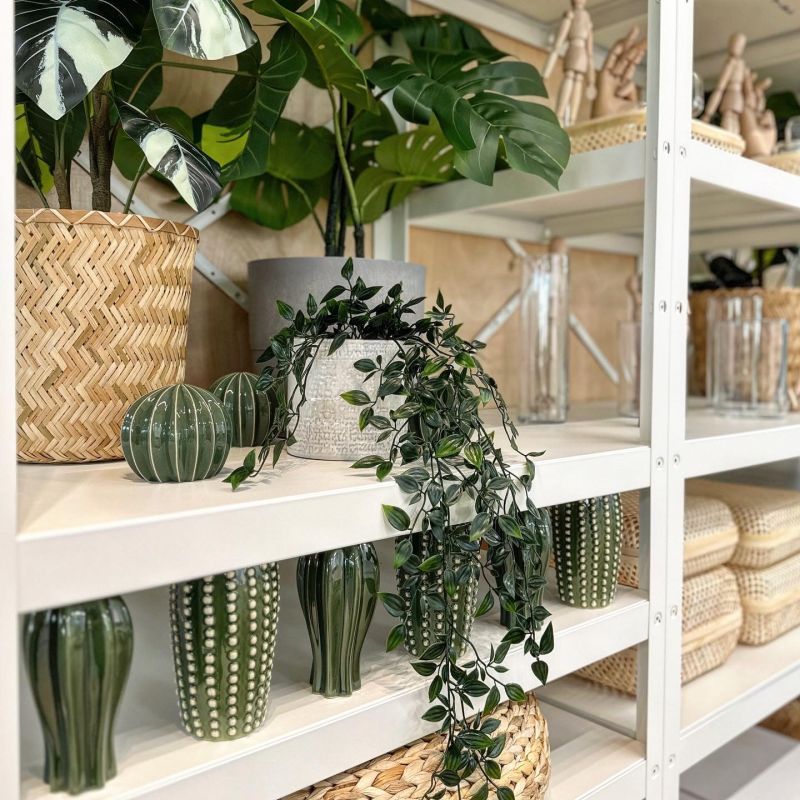
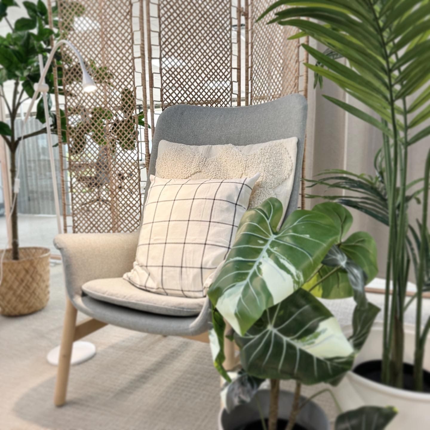
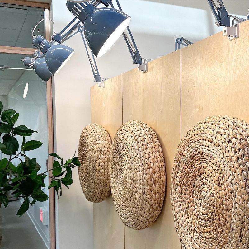
After about a year filled with drawings, construction, furnishing, and installations, we visited again to finalize the interior design and graphic design elements. The result was a well-planned sound and light plan with a more open layout. It now has a humble, Scandinavian-designed, welcoming atmosphere with lots of Ikea feeling to it and values symbolized in the matching graphic design package that surrounds most of the walls and gives it color. There is plenty of space for spontaneous meetings, both internal and external. Two-thirds of the layout is dedicated to collaboration areas, meeting rooms (both open and closed), gaming areas, “Eat & Meet,” and lounges. These spaces have flexible furnishings and can be adapted for digital collaborations during larger meetings where all 250 employees can gather for information or celebrations.
With the star-shaped layout, we could effectively manage the flow and sound plan by placing desk areas and quieter zones at the far ends, where we only have smaller meeting rooms and phone booths, away from workshop areas, the main entrance, and spaces that benefit from and create a lot of activity and volume. Each area under the large skylights was given distinct functions such as education/library, workshop areas, and in the quieter parts of the star layout, functions such as recovery and quiet focus workrooms.
We decided to visit the site to experience the layout, ceiling height differences, and installations in person. Although floor plans and guided FaceTime tours were helpful and done several times, nothing could replace the physical meeting with everyone involved and experiencing the nearly 4000 square meter star-shaped layout, which is unique and special.
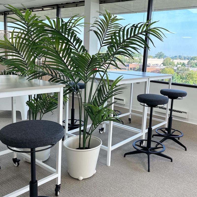
We are very pleased with the result and look forward to visiting again. When we asked Ikea, they said: “The Philly office is AMAZING. Everyone loves it and it is such a great use of the space!” We are grateful for this project and look forward to future office projects together with this team. Thank you.
Concept and interior design PLYM
Graphic Design Shiraz & Daryan
