IKEA Headoffice Taipei
interior concept development and communication design
Background
When IKEA Business Taiwan in Taipei needed to move to a new office to better meet the business daily needs and to open up for a more inspiring and creative workspace they had a brilliant idea. Instead of just using the office for working by a desk they could let the entire space to work as a showroom for their business clients. They could practice their daily work and test the product range and put the items in their actual context and at the same time show inspiring and practical solutions for their customers all at once.
The previous way of working only offered the common options of working by a desk or in a meeting room and the new office needed a lot more levels and shades in between. It also needed a big working lounge and a dining area. It all came down to an all-inclusive headquarters-project for IKEA Business Taiwan and their owners Dairy Farm that we started working on in 2019. Both on site in Taipei and at distance we workshopped and developed new ways of using products from the IKEA range to create smart and selling solutions for other companies. The result also became a perfect office for the IKEA co-workers.
Concept and result
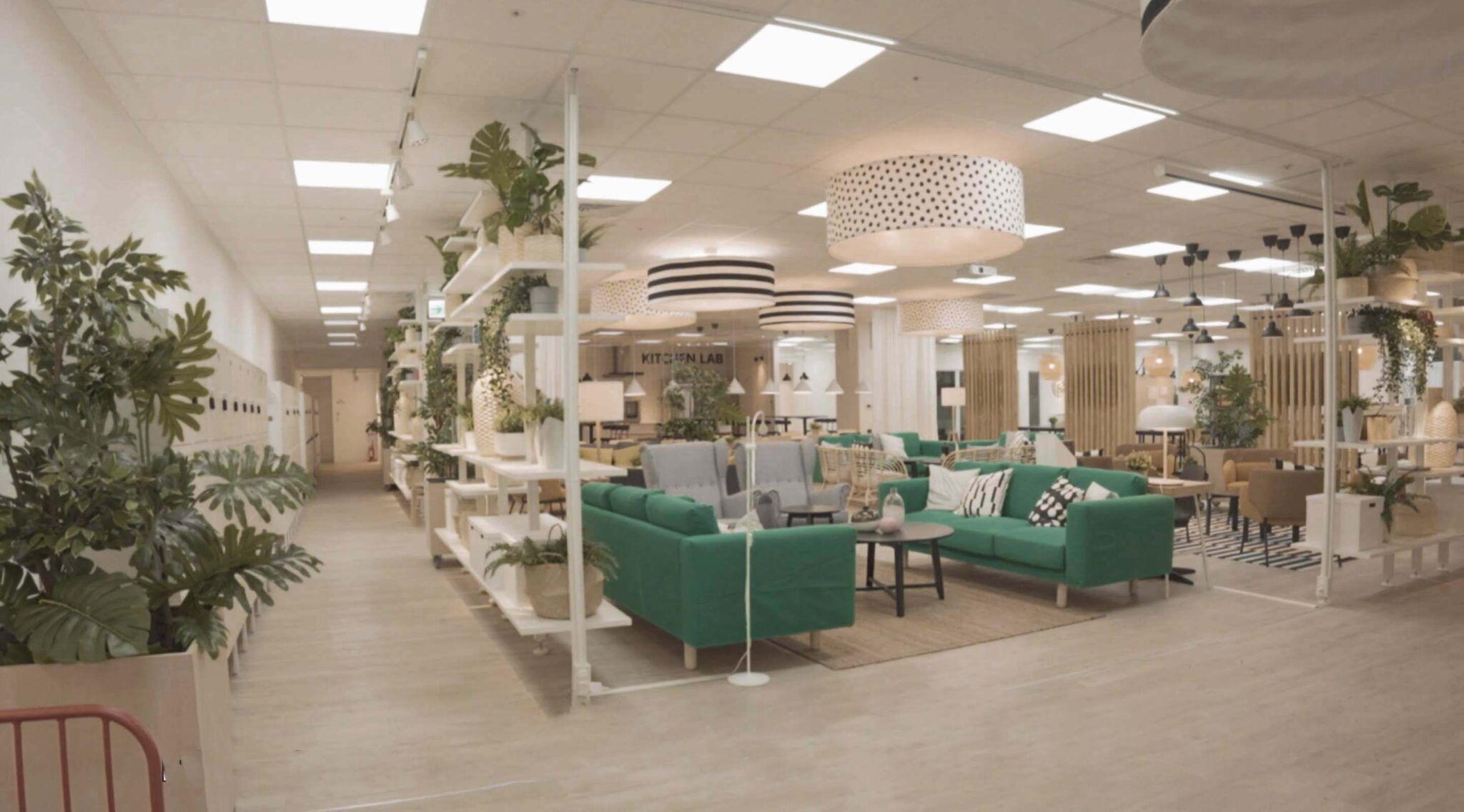
Home furnishing for the many people in Scandinavian design is the first thing that welcomes you at IKEA Business Taiwan. A large lounge area for coffee and spontaneous meetings grades up in a higher dining space for meeting and eating with a minimalistic and graphic kitchen sets the final scene further back in the space. And it’s just home furnishing for the many people that should be allowed to be the focus – the core and soul of IKEA.
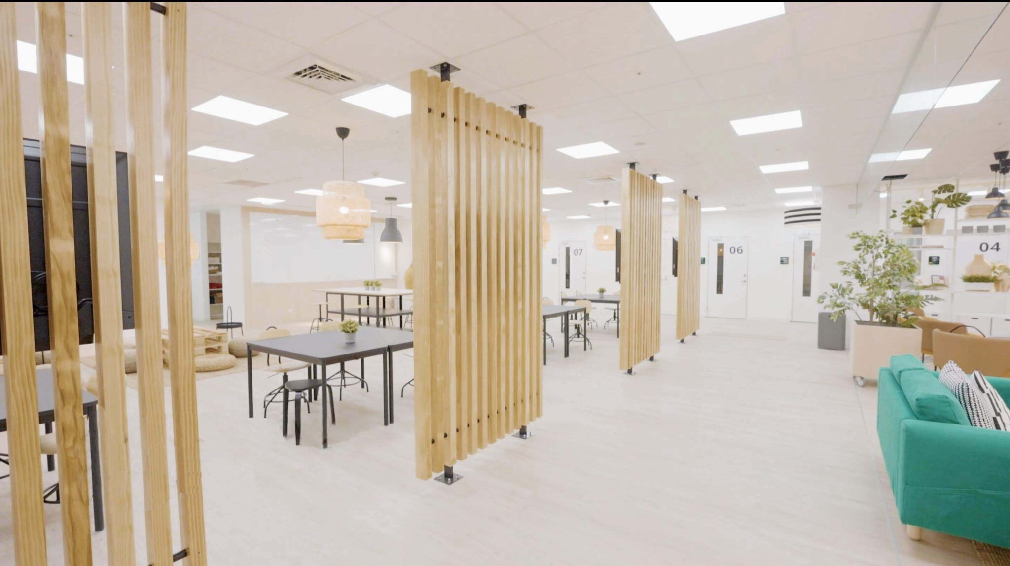
This may be a Business center but it’s also an important part of the workspace. Some of the best ideas may be born over a cup of coffee laid back on a sofa together with a coworker? A dining area functions perfectly as a meeting space when it’s not being used for eating. The lower level of heights in the beginning of the office makes it easy to overlook and understand and the semi transparent shelf sections that frames the open area shows the product when it, at the same time, does the job as a “wall”. Workshop areas and room for open meetings or activities picks up where the lounge and dining area ends. Curtains give flexibility and get to decide how open the meeting for the day is allowed to be. Stackable stools for extra seating can be found in shelving systems that also fill the function of workshop space with whiteboard and pinboard placed on its back. If the work of the day demands confidentiality, meeting rooms can easily be accessed lined up along the entire space.
As this is a showroom and an office at the same time the meeting rooms have different settings depending on specific needs and looks. Here you can find anything from a full scale interview room to board meetings, recording room, phone booths, large rooms with flexible walls for turning a 50 people meeting room to three rooms for twelve people as well as your regular meeting room from between 3-12 people. There’s even a room for karaoke and one for massages.
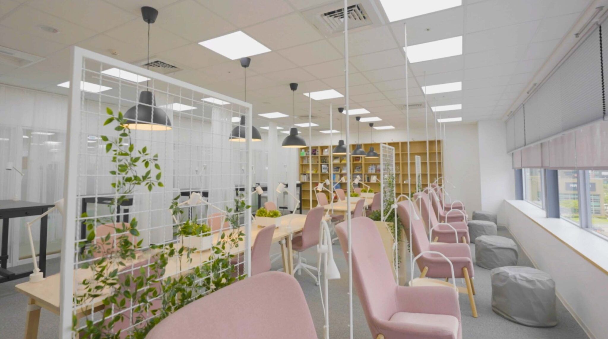
The entire office follows IKEAs most important keyword: simplicity. Simplicity in Scandinavian design, simplicity in easy to maintain but mostly and most important – simplicity in clearness. The different spaces in the office each speak their clear language so that it’s obvious how to use them. There’s no question in whether an open meeting space is an open meeting space since it’s furnished with several seats around a table, it’s easy to connect to a screen and a whiteboard on wheels is within grabbing distance. Same way it’s obvious that you go to the focus area to focus on your own in one of the armchairs placed with some extra distance between each other high up on a podium to be able to enjoy the beautiful view of Taipei with your laptop on your knee before a deadline.
The use of Scandinavian design at IKEA is also obvious but since we are in Asia we like to flirt with Taiwanees details in the interior design. To connect everything in the office with the interior we worked together with design colleagues in Shanghai to put together graphic design in the form of communication, information and navigation.
Concept designer PLYM, Christel Friis
Communication Design Planet Design Studio
